You’re probably familiar with color field painting or at least you’ve seen some of it even if you didn’t know the name for it. Usually super large canvases with blocks of flat color with either sharp or blurred edges. The kind of stuff you see in the slider above from Mark Rothko, Barnett Newman, and me – I’ve decided to take a stab at doing some color field photography.
Color field painting was first developed in the 1940s by the likes of Rothko and Newman and Clyfford Still. There are different flavors of color field paintings, but they all share the same large areas of color that are painted in a flat style without obvious brush strokes. Some like Rothko’s blend and blur while others like Newman’s have distinct clean edges. Where most color field artists employ geometric shapes, painters like Still and Helen Frankenthaler used more organic shapes.
Abstract expressionist artists like Jackson Pollock wanted to express their inner most emotions and rhythms through physical action – they dripped, they splashed, they threw paint onto their canvases to create ‘action’ paintings. Action paintings have lots of texture to reflect the artist’s hand. The artist wants you to be able to ‘see’ them working on the painting and join with them in what they are expressing physically.
Color field artists tend to paint smoothly without obvious brush strokes. Frankenthaler developed a technique where she poured thinned paint onto the canvas to eliminate all texture. Color field artists want to evoke emotion in the viewer strictly through color. They want to create a place where the painter has moved to the background and the colors in the foreground evoke universal shared emotions.
I’m interested only in expressing basic human emotions. And the fact that a lot of people break down and cry when confronted with my pictures shows that I can communicate these basic human emotions.
Mark Rothko
You can’t really experience good color field paintings on the web. You have to go and see them. You have to go to a museum and stand or sit in front of them. You have to take time with them. Most color field works are huge. These ain’t no 16″ x 20″ framed prints. They run more along the lines of 6 feet by 17 feet! The idea is to fill the viewer’s field of vision so that the colors are all that they see. There are no distractions and no frame edges, just color that goes on forever. The viewer can submerge in the painting and encounter their own experience. This kind of experience reaches its zenith at the Rothko Chapel in Houston, TX. The building is designed for contemplation and reflection and built completely around a group of very large Rothko paintings that cover the walls and surround the visitor.
Creating good color field photographs is going to be challenging. It’s going to be tricky to find subjects that resemble color fields. People don’t often think about painting their buildings or signs in terms of evoking basic human emotions through color alone. Large expanses of flat even color are rare and I don’t want to change the colors artificially in software. Where a painter can choose any colors they like based on the mood they’re trying to project, I have to take what the world gives me. Of course I also can’t create wall sized prints so you’ll have to sit real close to your monitor and hope for the best.
I’m on a bit of a mission to create color field photos as best that I can. I’m constantly on the lookout for subjects that will work. So far the best place I’ve found is around the local university campus. They have some good signage with the school colors on them and no doubt you’ve figured out that the photo in the slider at the top of the page is from a tennis court. I’m going on a trip in a few weeks so we’ll see what I can find in another city.
In the meantime here are a couple more photos that I’ve done so far. This first one is a nice block of red and black. The colors aren’t as smooth as I’d like but not too bad.

Media: Digital Photograph
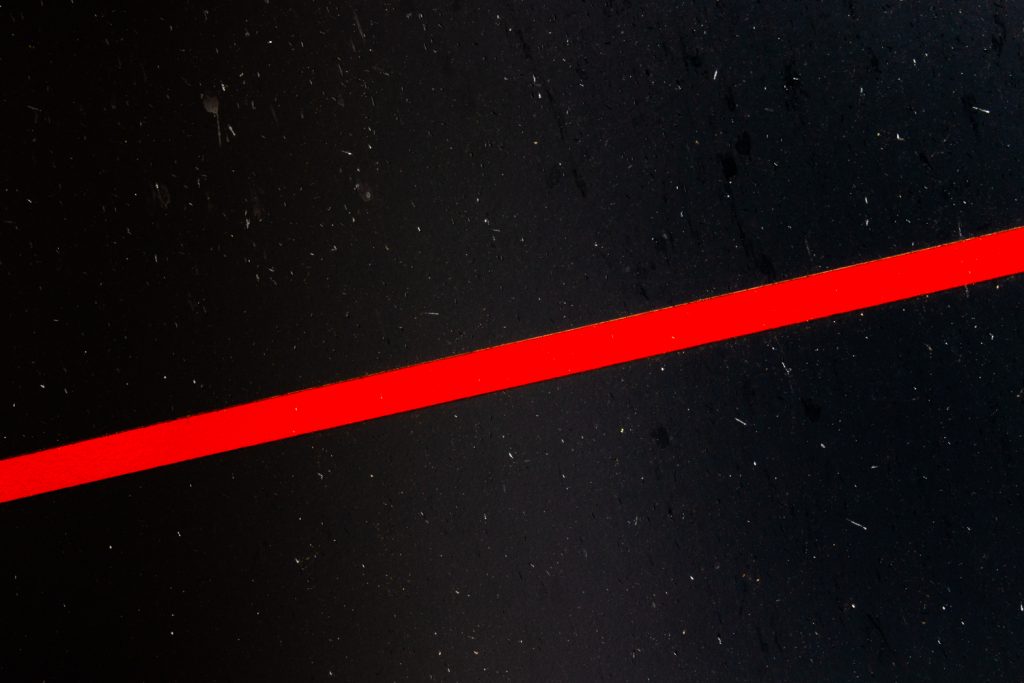
This next one is a play on Newman’s ‘zip’ paintings. Newman used vertical lines, but I only had a horizontal and besides I decided to change it up a bit by tilting the image to give a diagonal. The white flecks in the black mess up the smoothness of the color field but on the other hand they give it a nice stars in space feel that I like.
Newman proclaimed Onement, I to be his artistic breakthrough, giving the work an importance belied by its modest size. This is the first time the artist used a vertical band to define the spatial structure of his work. This band, later dubbed a “zip,” became Newman’s signature mark. The artist applied the light cadmium red zip atop a strip of masking tape with a palette knife. This thick, irregular band on the smooth field of Indian Red simultaneously divides and unites the composition.
MoMA https://www.moma.org/collection/works/79601

Media: Digital Photograph


Hi Mark,
Interesting! And great that you’re exploring other directions in your work.
Regards
Hi Mark,
Just wanted to wish you a Happy New Year – may it be a better one.
Regards